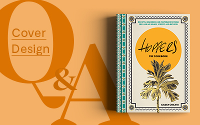
Cover Design Q&A: Hoppers: The Cookbook
13 Dec 2022 |
Welcome back to our Cover Design Q&A series! This month we spoke to the amazing Luke Bird about his work on Hoppers: The Cookbook, discussing his design process, the brief, and his go-to Hoppers order! Specialising in book design, Luke is the talent behind some truly incredible covers, and has worked on previous Quadrille titles such as Loaf Story, Three and F*ck Being Humble. You can see more examples of his work on his website, Instagram, or on Twitter.
Tell us about yourself.
I am a freelance designer who specialises in book design. Most of my work involves covers for fiction and non-fiction, but I relish the opportunity to work on food and lifestyle books.
My first jobs in publishing were at Canongate Books in Edinburgh and then at Faber & Faber in London, where I worked as a senior designer for seven years. In 2017 I took the daunting plunge into the freelance world. I’m very fortunate that I now get to work with publishing clients from all over the world.
What was the brief?
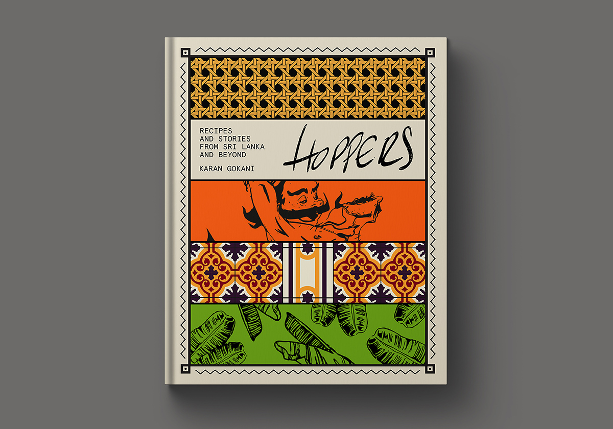
Karan (the author) wanted the book to reflect the people, culture and food of Sri Lanka. He wanted the readers to “join him on a journey” through the island. He described the book as “…the story of Hoppers told through imagery, recipes and personal memories.”.
In addition, the book needed to represent one of the most celebrated restaurants in London and had to feel like an extension of the vibrant and recognisable Hoppers brand. It had to feel stylish, tactile and in-keeping with the market for high-end, restaurant cookbooks.
Whom did you have in mind as the consumer/audience?
The challenge as a designer here was to balance the two sides of the brief, which would also inform the audience. We needed to appeal to those that have an interest in Sri Lankan food (and perhaps food from the Indian subcontinent generally), and those consumers who want to buy the latest cookbook from a celebrated London restaurant.
These consumers expect to pay £30ish for a new cookbook. It needs to look as good on the coffee table as it does on a shelf. That said, they want to cook from it so it’s not just for show. The recipes should be clean, clear and easy to follow.
How was it working with an already established brand? How did the Hoppers brand identity feed into your design?
Hoppers has an incredibly strong visual identity (both as a brand and in terms of the restaurant interiors) and it was really important to bring that into the cover as well as the interior of the book.
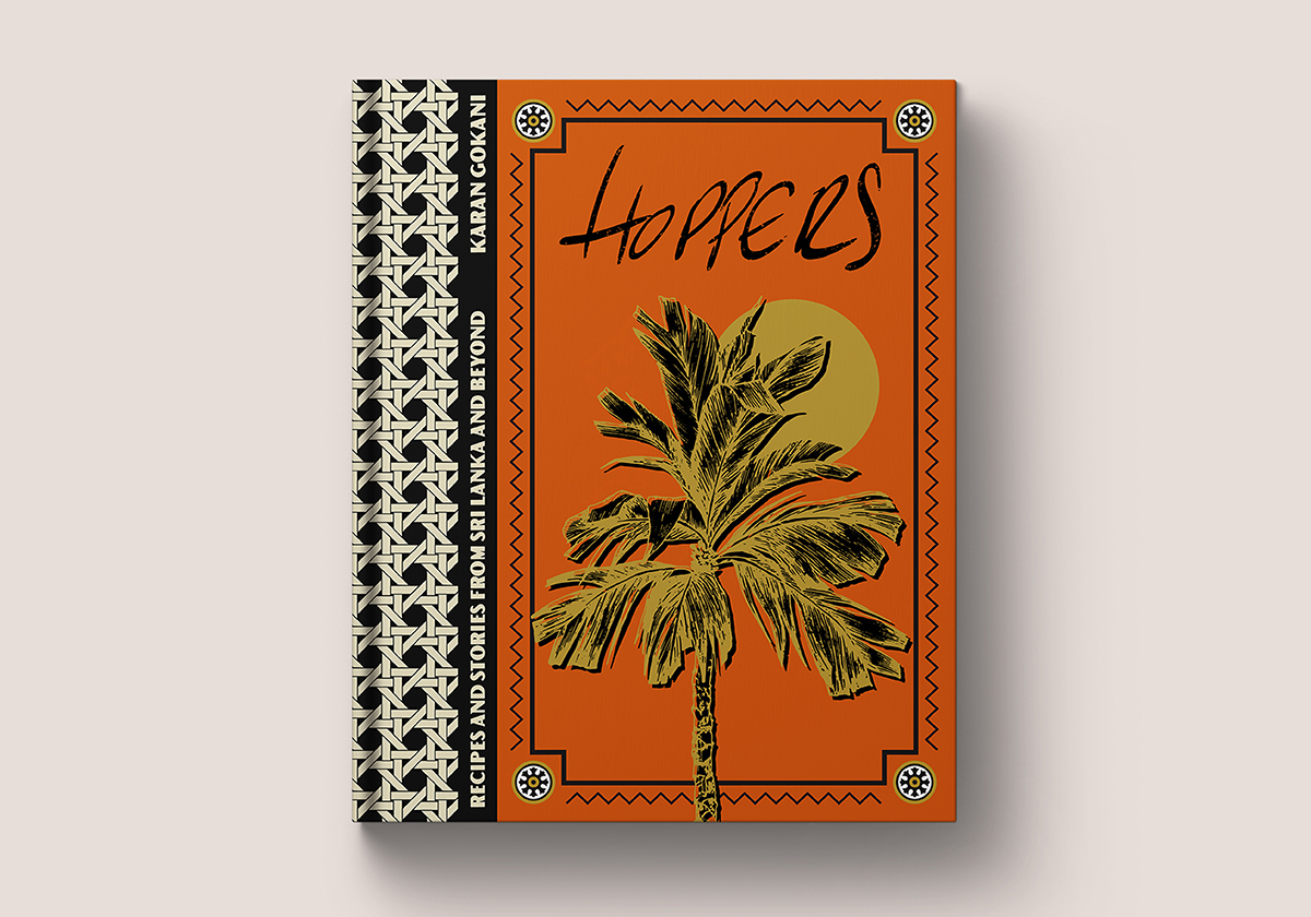
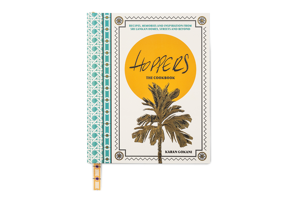
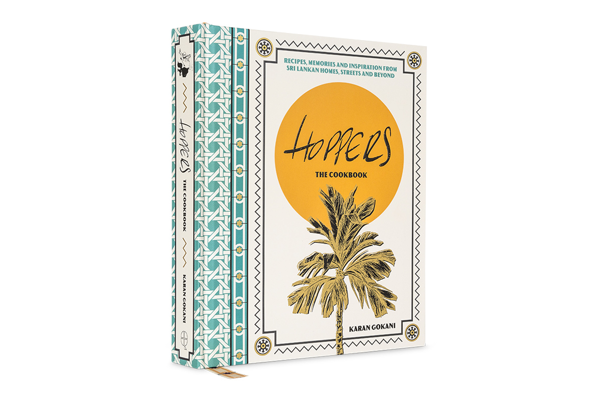
We used the main Hoppers logo on the front cover of the book and various small touches from the restaurant interiors, throughout, to reference the experience of eating at Hoppers and to act as small “easter eggs” in the book. For instance, we used the rattan pattern from the chairs in the Marylebone restaurant on the spine, and a bespoke ribbon which has a pattern to mirror the floor tiles in Hoppers’ original Soho restaurant.
Can you share with us the process of this project? What was the idea and inspiration for the cover design and layout?
This project was, truly, a team effort. There are so many people that fed into the project but in terms of the design, Claire Rochford (Art Director at Quadrille), myself, the photographer, Ryan Wijayaratne, Rosa (aka Mr Guns) – the illustrator we worked with on various decorative elements – and Karan came together and formed a design team which worked really hard to make sure that the whole book was a realisation of Karan’s visual ambition for the book.
The first step for me as a designer was to spend some time with Karan at the restaurants to get a sense of the Hoppers story and his hopes for the project. I’ve probably never worked as closely with an author and I found the process exciting and really energising as a designer.
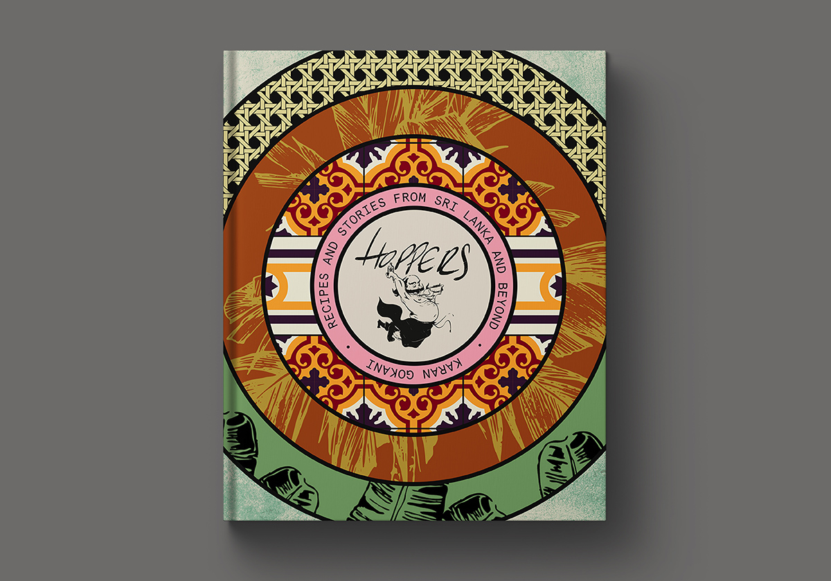
As well as recipes and anecdotes, we also had a vast quantity of incredible travel and food photography which I needed to include, as well as some illustrative elements, menus and an extensive pantry section in addition to the recipes.
I made the decision to split the different chapters in the book by colour, to give the book a real vibrancy and help with navigation. The fonts were carefully chosen to blend seamlessly with Hoppers’ visual branding.
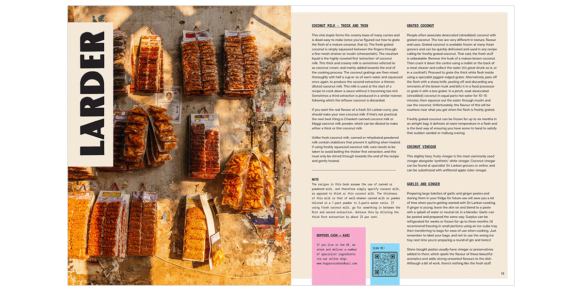
We shot the recipes over 10 days – some in a studio and some in the three Hoppers London locations. Throughout we tried to bring colour, sunshine and a human element to the shots.
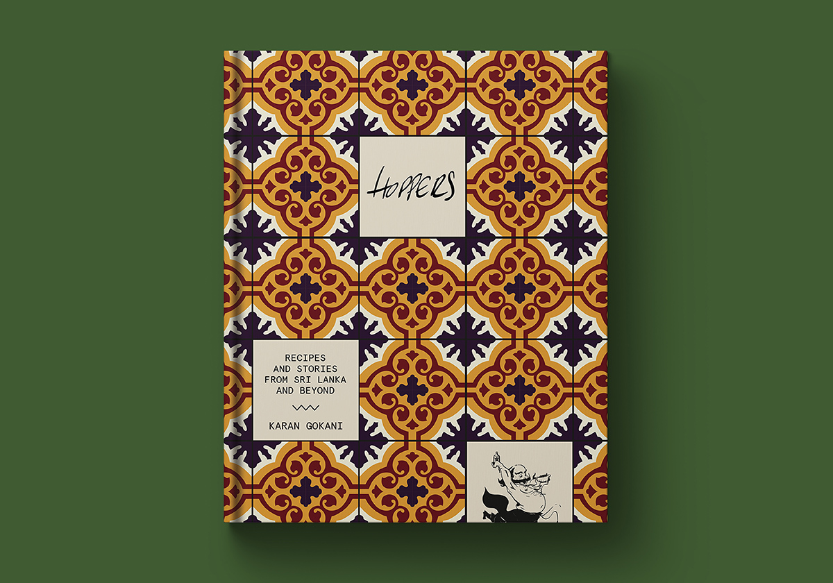
I built the cover using the aforementioned elements from the restaurant. Patterns from tiles, rattan, other materials and the Hoppers branding came together with a banana tree and a sun, which were loosely influenced by posters which adorn the walls in the restaurants.
Hoppers: The Cookbook is a stunningly designed book with beautiful finishes. Would you please talk us through some of the finishes? And were the finishes and treatment all planned from the start?
Karan and I undertook various trips to bookshops to look at the market and potential competitors, and we noticed that lots of them were adorned with finishes and felt really “gifty”. Lots of them even had one stand-out finish which helped set it apart on a table or shelf, so we felt Hoppers would need to have its own point of difference.
From the outset, Karan was keen to bring some tactility and differentiation in texture to the cover, and we explored numerous ways to make the “rattan” element of the cover feel like actual rattan; settling on embossing and a grain lamination. We also used a gold foil to really lift the tree and some elements of the Hoppers branding throughout the package, and embossing to bring the Hoppers logo to the fore.
Perhaps the most unusual finish, though, is the aforementioned bespoke printed ribbon, which matches the tile design in the Soho restaurant.
You work across both non-fiction and fiction – do you prefer one over the other? How is the cover design process different?
In the vast majority of cases, fiction design starts by reading a manuscript in conjunction with a brief and producing a visual reaction to the narrative. Often a brief can be very open which allows for plenty of creativity.
Non-fiction tends to be slightly different. It’s not always necessary (though I do always try) to read some or all of the book, and it’s then a question of finding the image or icon which best captures the overriding theme/s of the book. It almost always calls for a less abstract approach, but I think it can be every bit as creative as designing fiction if you take the right approach and steer clear of visual tropes.
As a designer who commissions illustrations often, how do you discover and network with new illustrators?
We were lucky when working on Hoppers that Karan was already using a super talented Sri Lankan illustrator called Mr Guns for various pieces of restaurant marketing and interior design, so no research was required for this particular job.
On the whole, sadly, I don’t commission as much illustration as I would like but when I do, I enjoy looking for young illustrators who have recently graduated and might offer a surprising and striking approach to a brief.
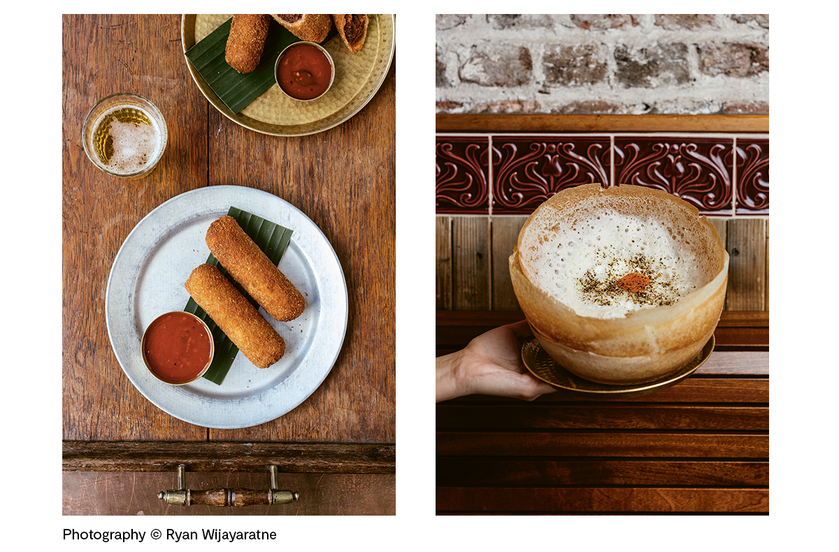
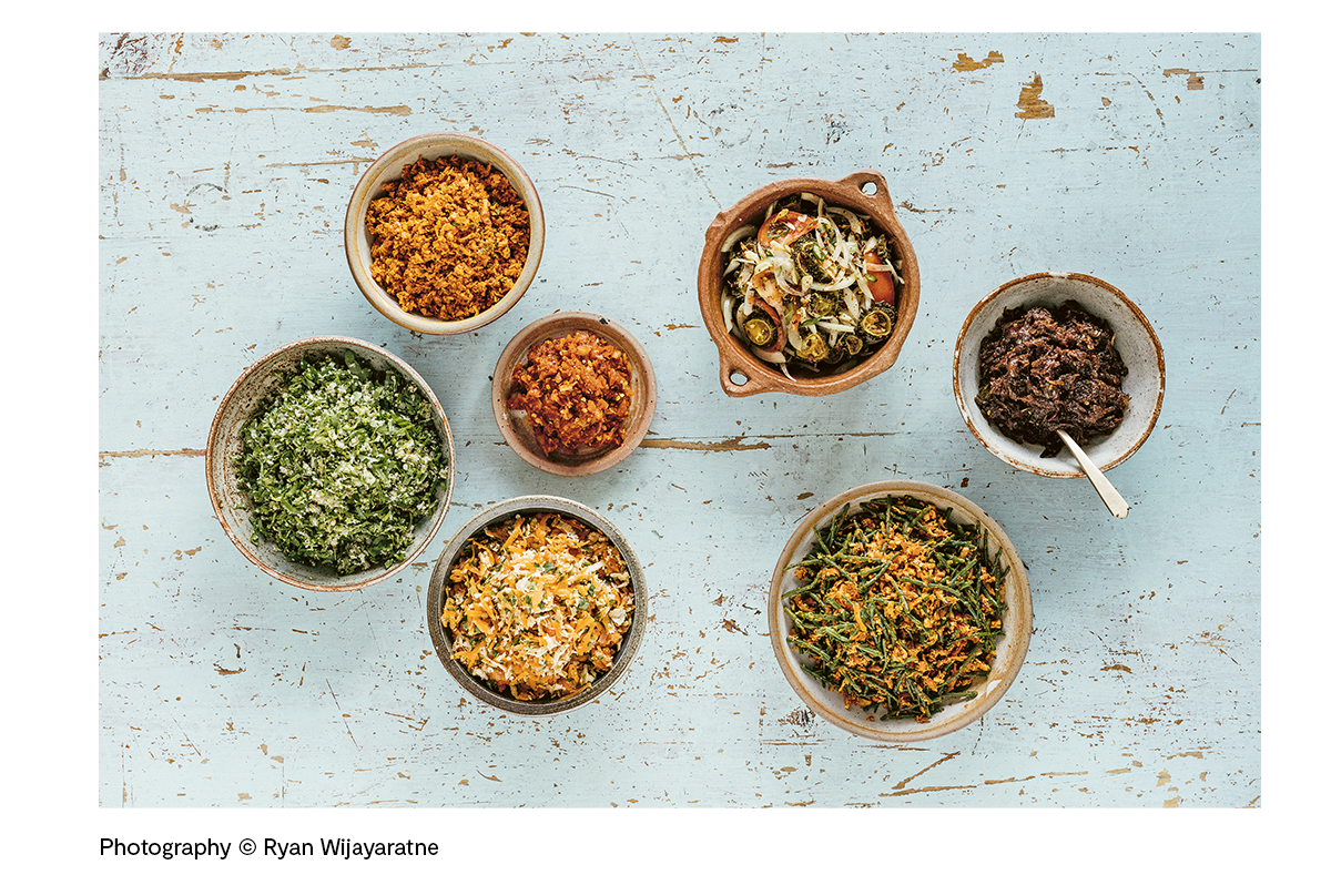
What do you always order when you visit Hoppers?
Mutton rolls (left), crab kari, egg hopper (right) and – most important of all – all the sambols (below) and all the chutneys.
Now that the secrets of the Hoppers recipes are out, do you have plans to attempt recreating any of the dishes at home?
Absolutely. The first time I cooked Sri Lankan food at home I lived in London and had to travel to a Sri Lankan shop way out of town to get the ingredients I needed. We had recently returned from a trip in the country and I was craving the flavours I had been introduced to on the island. These days it’s easier. Good supermarkets sell lots of the fresh ingredients and Hoppers has its own online shop Cash and Kari – which sells some of the ingredients and spice mixes which are harder to source in the UK.
Having seen the talented chefs in the Hoppers’ kitchen who have perfected the art of making Hoppers themselves, I am slightly daunted but determined to get hold of a Hopper pan and give it a crack.
Hoppers: The Cookbook by Karan Gokani is out now, available from local bookshops, Waterstones and Amazon.
Read our previous Cover Design Q&As!
Oren with Stuart Hardie | From Scratch series with Lucia Vinti | Fire Feasts with Emily Lapworth | Advent with Emily Lapworth | The Italian Deli with Katherine Keeble | Crave with Claire Rochford | Sea and Shore with Nikki Ellis | La Vita è Dolce with Susan Le | Bowls and Broths with Han Valentine | The Nordic Baker with Gemma Hayden